Advanced R for Econometricians
Data Visualisation with ggplot2
Martin C. Arnold, Jens Klenke
Data Visualisation
R is a free software environment for statistical computing and graphics. — R-Projekt
Data Visualisation
R is a free software environment for statistical computing and graphics. — R-Projekt
There are three major graphical systems:
- R base graphics
latticeggplot2
Data Visualisation
R is a free software environment for statistical computing and graphics. — R-Projekt
There are three major graphical systems:
- R base graphics
latticeggplot2
In this course, we will focus on ggplot2. If you want to learn about the others,
R Graphics
is a great source.
ggplot2
What is ggplot2?
- an R package for data visualisation
- implementation of the Grammar of Graphics in R
- part of the tidyverse
ggplot2
What is ggplot2?
- an R package for data visualisation
- implementation of the Grammar of Graphics in R
- part of the tidyverse
Some interesting links:
- R for Data Science
- ggplot2: Elegant graphics for data Analysis
- R Graphics Cookbook
- R Graph Gallery
- DataCamp
The Layered Grammar of Graphics
The grammar consists of
- data
- aesthetic mappings (e.g. mapping of data to x and y coordinates, size, color, shape, ...)
- geometric objects (e.g. points, lines, bars, ...)
- scales (controls mapping from data to aesthetics , e.g., which colors should be used)
- facets (splitting data to create plots for subgroups)
- statistical transformations (summarize data before plotting)
- coordinate systems (e.g. Cartesian, polar, ...)
The data, mappings, statistical transformations and geometric objects form a layer. A plot can have multiple layers.
A Basic Example
Example
library(ggplot2)data("diamonds")ggplot(data = diamonds) + geom_point(mapping = aes(x = carat, y = price))A Basic Example
Example
library(ggplot2)data("diamonds")ggplot(data = diamonds) + geom_point(mapping = aes(x = carat, y = price))ggplot()
- Creates a coordinate system that you can add layers to.
- Everything you provide as an argument will be the default for all added layers.
A Basic Example
Example
library(ggplot2)data("diamonds")ggplot(data = diamonds) + geom_point(mapping = aes(x = carat, y = price))ggplot()
- Creates a coordinate system that you can add layers to.
- Everything you provide as an argument will be the default for all added layers.
geom_point()
- Adds a layer of points.
- Each
geom_*function takes a mapping argument, which paired withaes()defines how variables in your data are mapped to visual properties.
A Basic Example
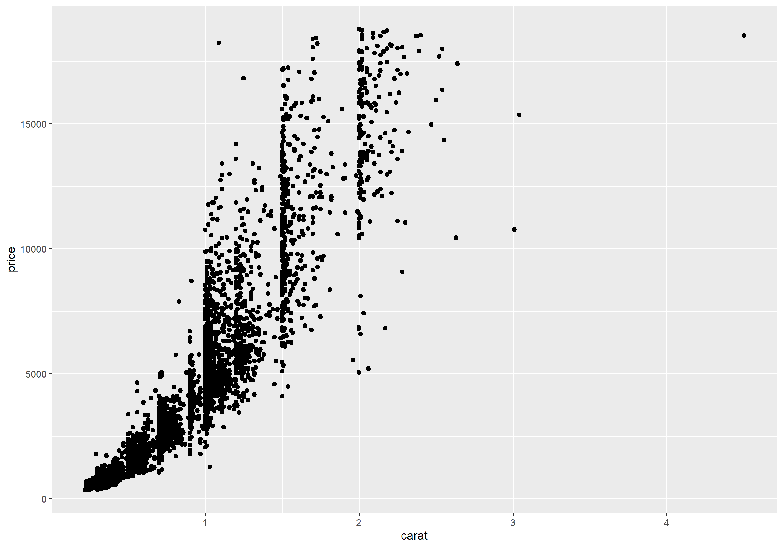
not the whole dataset included
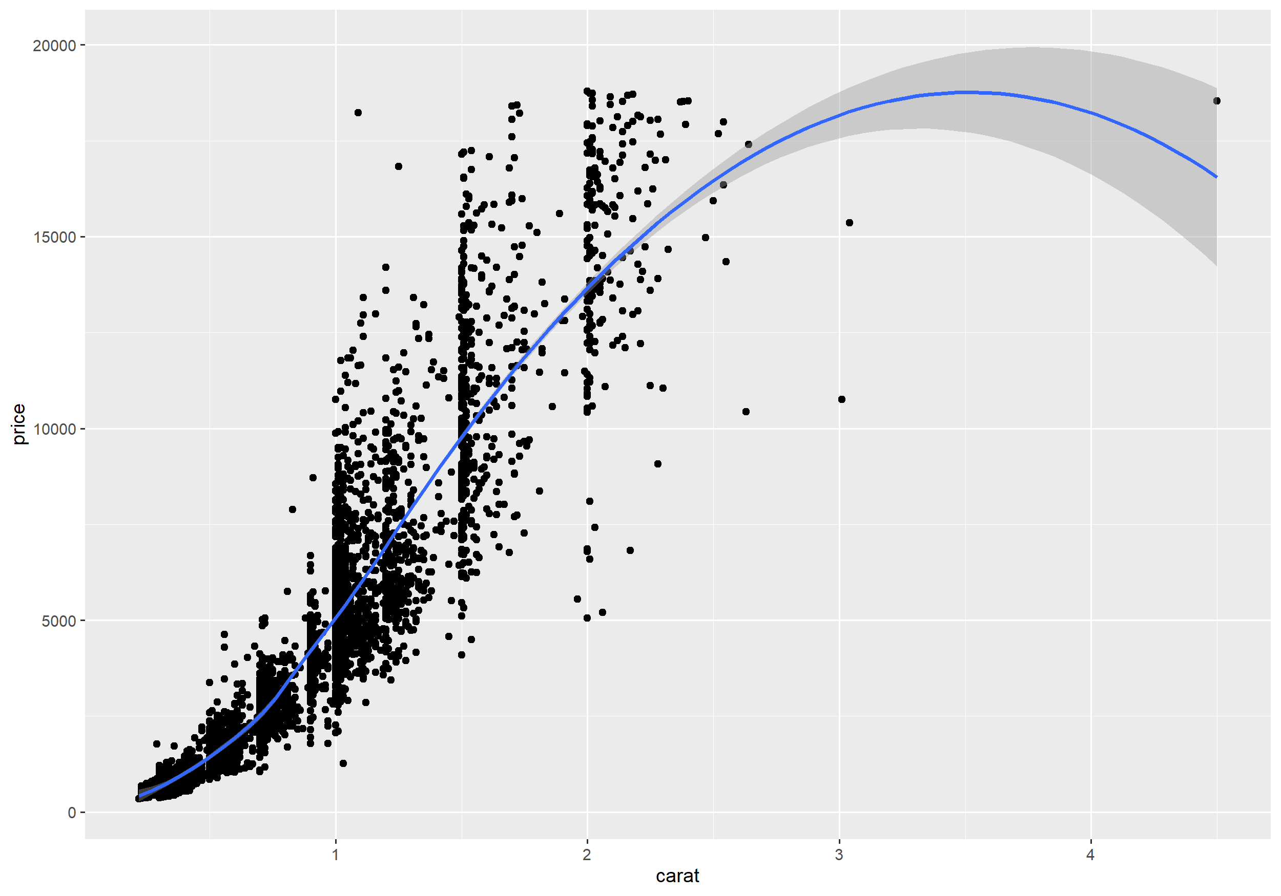
Adding Layers
To make the (possibly nonlinear) relationship in the data easier visible we add a smoothing function to the plot.
Adding Layers
To make the (possibly nonlinear) relationship in the data easier visible we add a smoothing function to the plot.
Example
ggplot(data = diamonds) + geom_point(mapping = aes(x = carat, y = price)) + geom_smooth(mapping = aes(x = carat, y = price), method = 'loess')Adding Layers
To make the (possibly nonlinear) relationship in the data easier visible we add a smoothing function to the plot.
Example
ggplot(data = diamonds) + geom_point(mapping = aes(x = carat, y = price)) + geom_smooth(mapping = aes(x = carat, y = price), method = 'loess')To write more compact code we can
- omit the parameter names
- switch
mappingtoggplot().
Adding Layers
To make the (possibly nonlinear) relationship in the data easier visible we add a smoothing function to the plot.
Example
ggplot(data = diamonds) + geom_point(mapping = aes(x = carat, y = price)) + geom_smooth(mapping = aes(x = carat, y = price), method = 'loess')To write more compact code we can
- omit the parameter names
- switch
mappingtoggplot().
The same mapping is then used for all layers (but can be overwritten if necessary).
Example
ggplot(diamonds, aes(carat, price)) + geom_point() + geom_smooth(method = 'loess')Adding a Layer
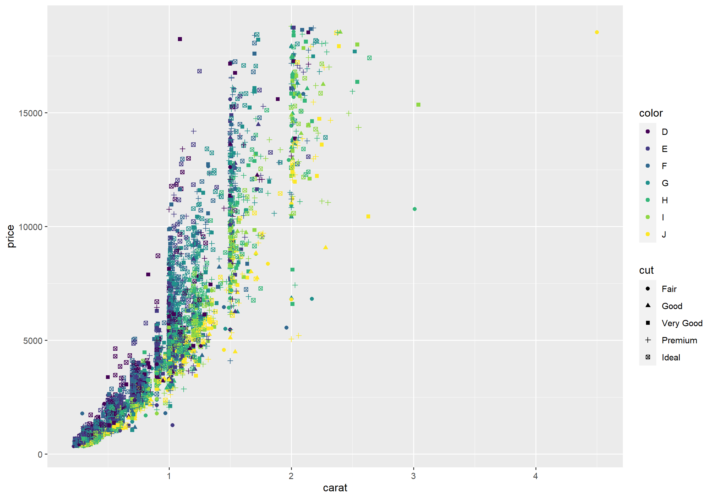
Aesthetics
- Until now we only used the x and y coordinates as aesthetics.
?geom_point()tells us about further aesthetics that we can map data to.- Each geom has its own set of aesthetics.
Aesthetics
- Until now we only used the x and y coordinates as aesthetics.
?geom_point()tells us about further aesthetics that we can map data to.- Each geom has its own set of aesthetics.
Example
ggplot(diamonds, aes(x = carat, y = price, color = color, shape = cut)) + geom_point()Aesthetics
Exercise
- Experiment with
geom_point()using themtcarsdata set. Try out different aesthetics with different variables. What do you note?
Specifically explain the different behaviour of factor and numeric variables for e.g. color.
Statistical Transformations and Aesthetics
- If discrete variables are mapped to aesthetics, ggplot will automatically group the data.
- In this case every statistic transformation is performed by group.
Example
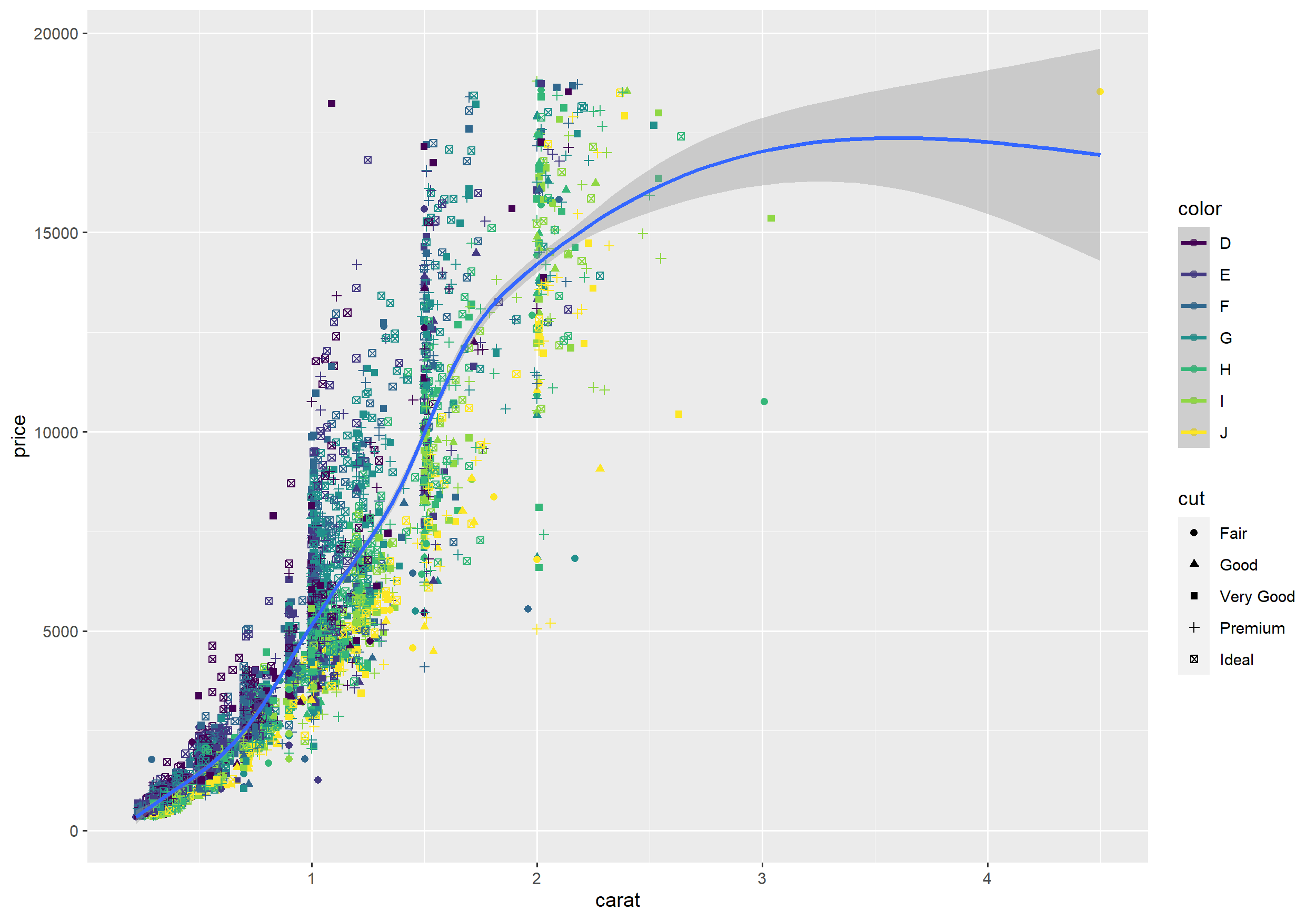
ggplot(diamonds, aes(x = carat, y = price, color = color, shape = cut)) + geom_point() + geom_smooth()Statistical Transformations and Aesthetics
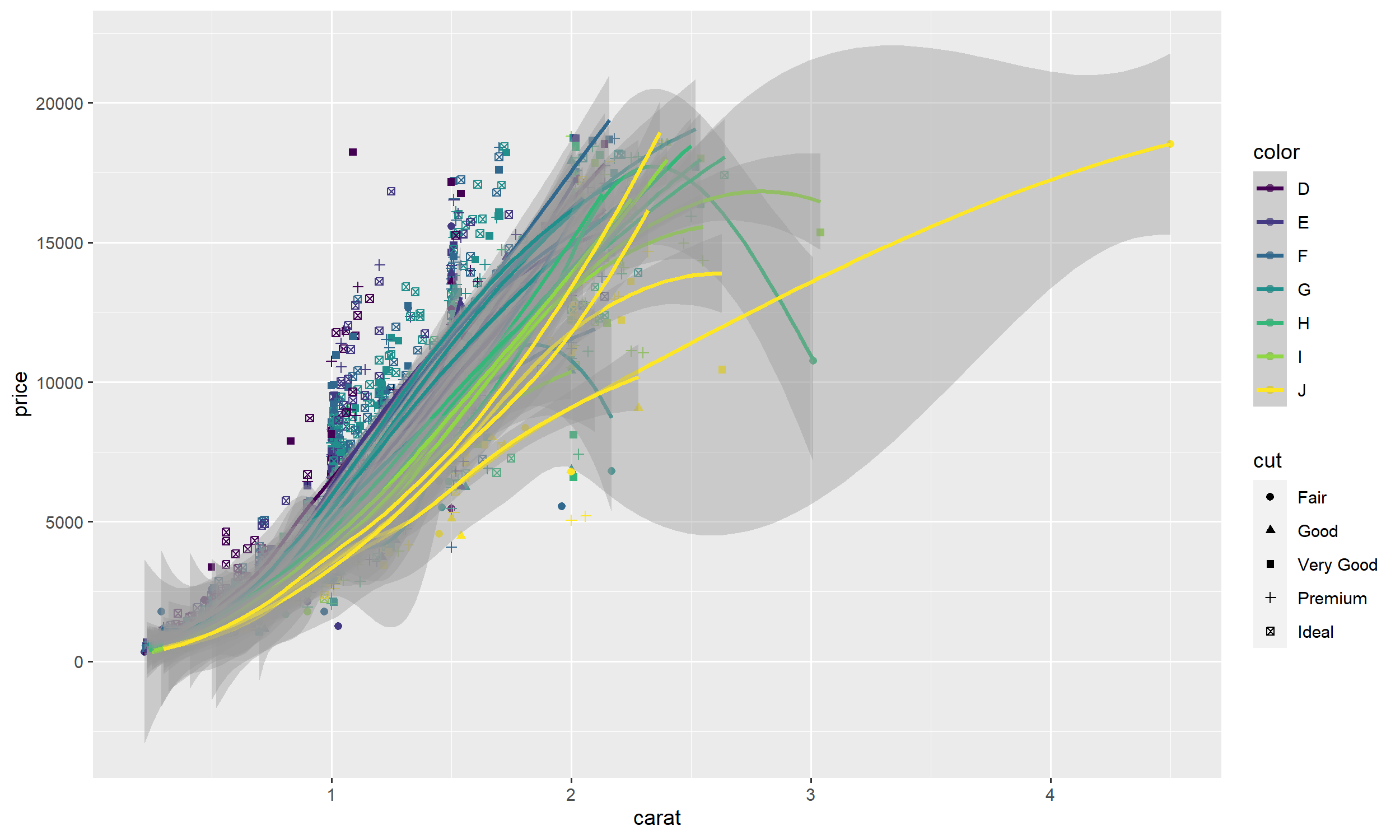
Statistical Transformations and Aesthetics
- If this is not desired simply move color and shape as additional aesthetics to
geom_point().
Example
ggplot(diamonds, aes(x = carat, y = price)) + geom_point(aes(color = color, shape = cut)) + geom_smooth()- Sometimes it is more convenient to leave all aesthetics in
ggplot()(e.g. if there are many layers) and overwrite the created groups by an arbitrary constant value.
Example
ggplot(diamonds, aes(x = carat, y = price, color = color, shape = cut)) + geom_point() + geom_smooth(aes(group = 1))Statistical Transformations and Aesthetics
Geometric Objects and Statistic Transformations
- Layers may be defined in terms of a geometric object (
geom_*) or a statistical transformation (stat_*). Each geometric object is associated with a default statistical transformation and vice versa.
Examples:
geom_point()has the identity function as statistical transformation.geom_smooth()fits a regression model before plotting a line with a prediction interval.
stat_smooth()is an alias which does essentially the same. However, in the first case we could change the statistic transformation and in the second case we could change the geometric object.- Often it is not a good idea to change the default behaviour (e.g. try
geom_point(stat = "smooth", method = "lm")) but we will see an example where it can be useful.
Exercises
- Use the mtcars data set and plot mpg vs. hp. Add a smoothing line to the plot.
- Add a smoothing function to the plot for each number of cylinders.
- Find out how to remove the confidence interval.
- Use a simple linear regression model and a quadratic regression model for smoothing.
Bar Plot
geom_bar() counts the number of observations within each group and produces a bar plot.
Example
ggplot(data = diamonds) + geom_bar(mapping = aes(x = cut)) # x should be discreteBar Plot
geom_bar() counts the number of observations within each group and produces a bar plot.
Example
ggplot(data = diamonds) + geom_bar(mapping = aes(x = cut)) # x should be discrete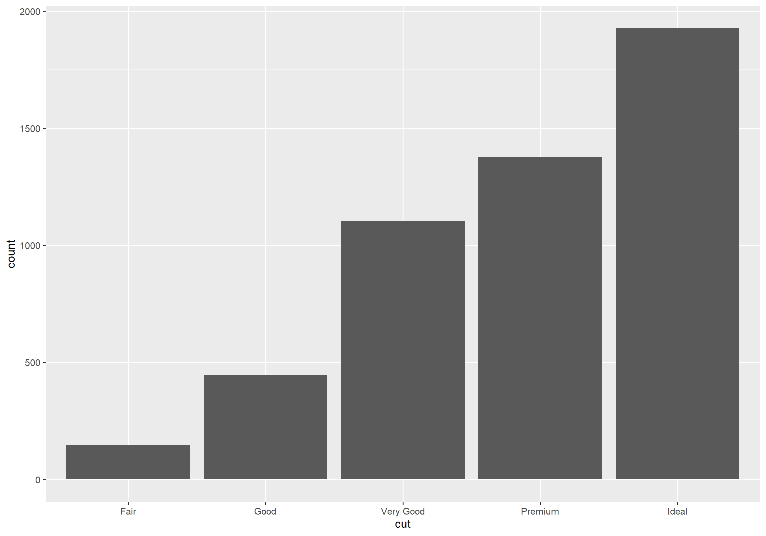
Histogram
Example
ggplot(diamonds, aes(x = depth, fill = cut)) + geom_histogram(binwidth = 0.1)Histogram
Example
ggplot(diamonds, aes(x = depth, fill = cut)) + geom_histogram(binwidth = 0.1)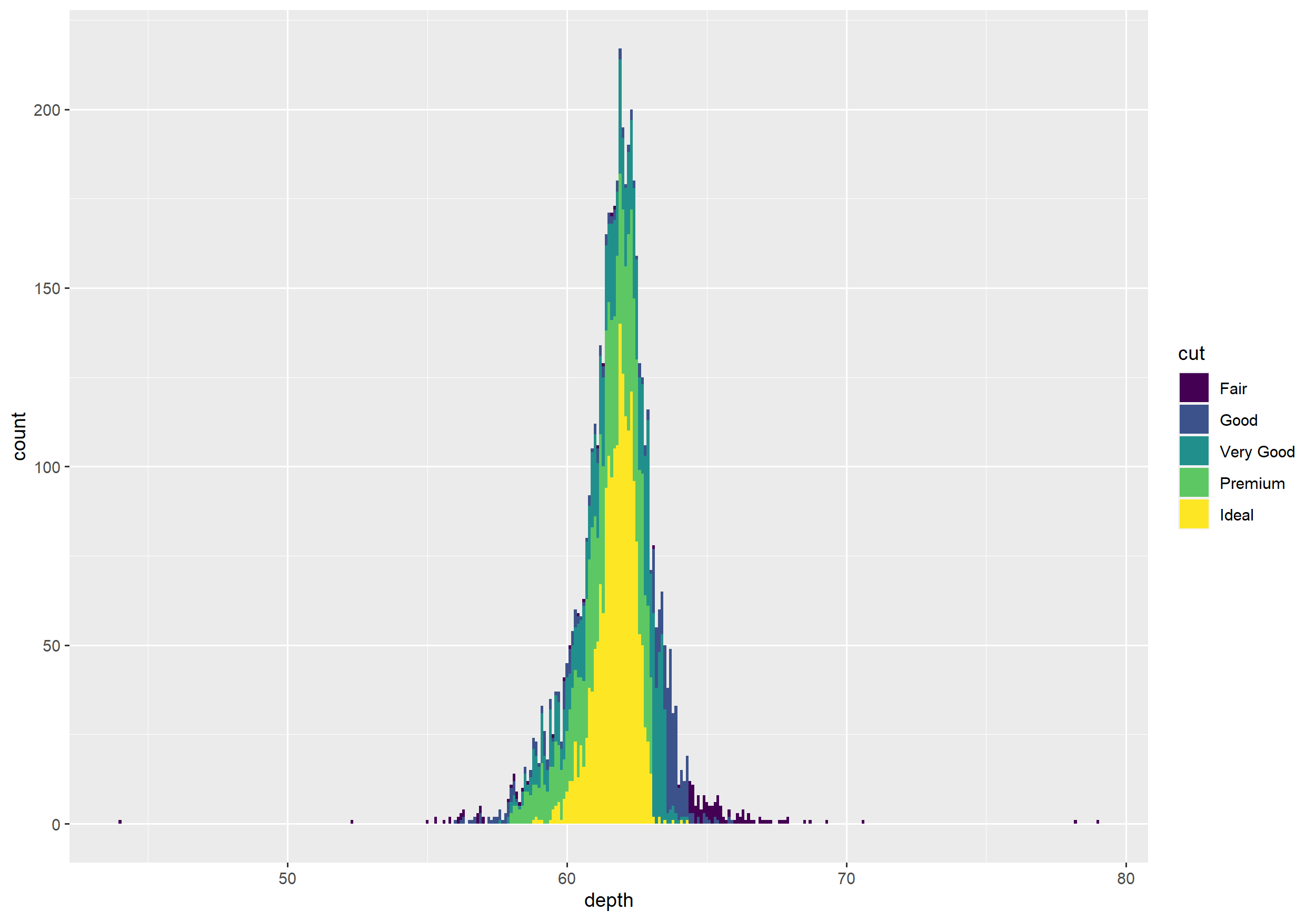
1D Density
Example
ggplot(diamonds, aes(x = depth, fill = cut)) + # try color instead of fill geom_density()1D Density
Example
ggplot(diamonds, aes(x = depth, fill = cut)) + # try color instead of fill geom_density()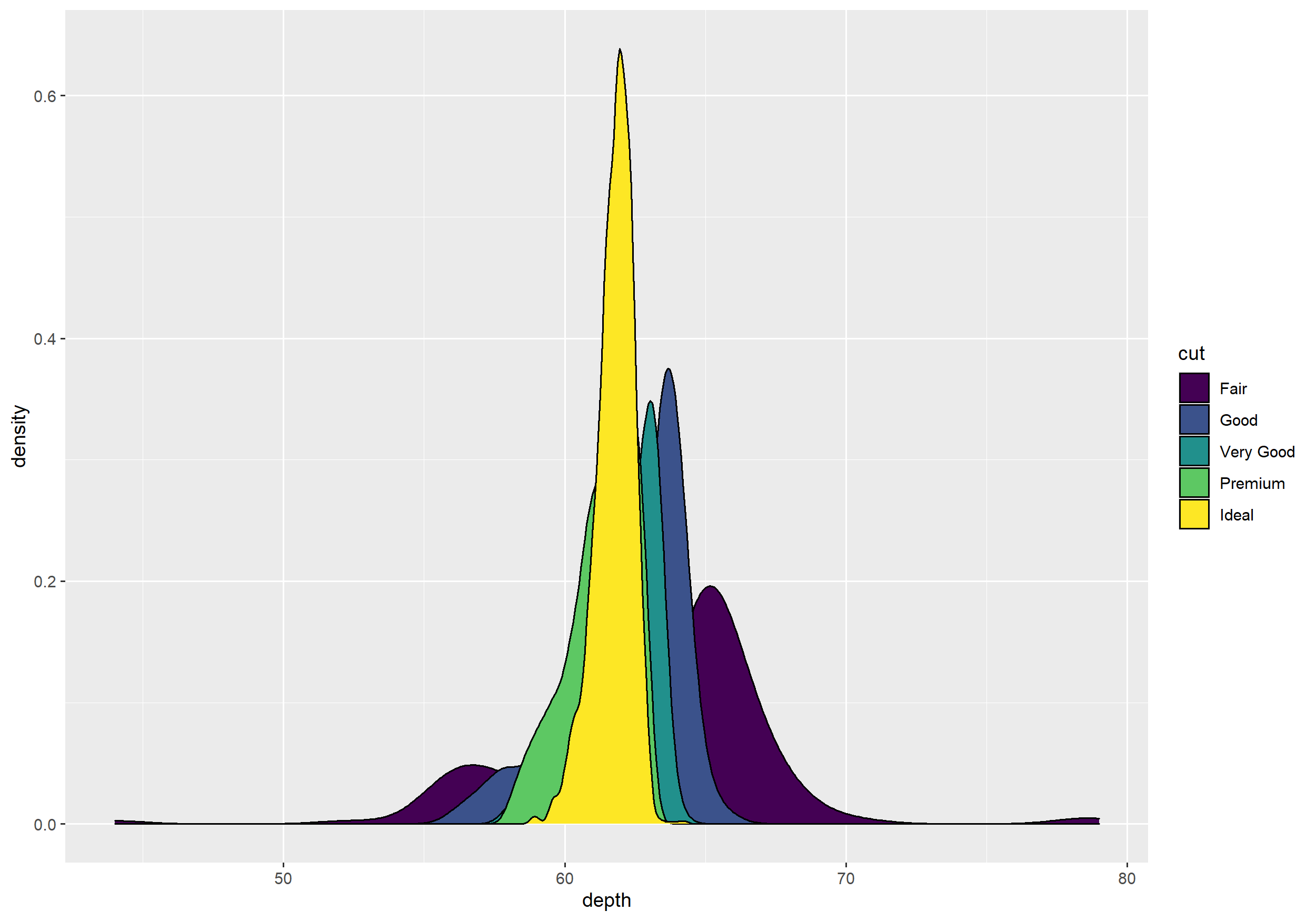
2D Density
Example
ggplot(diamonds, aes(carat, price)) + geom_point() + geom_density2d()2D Density
Example
ggplot(diamonds, aes(carat, price)) + geom_point() + geom_density2d()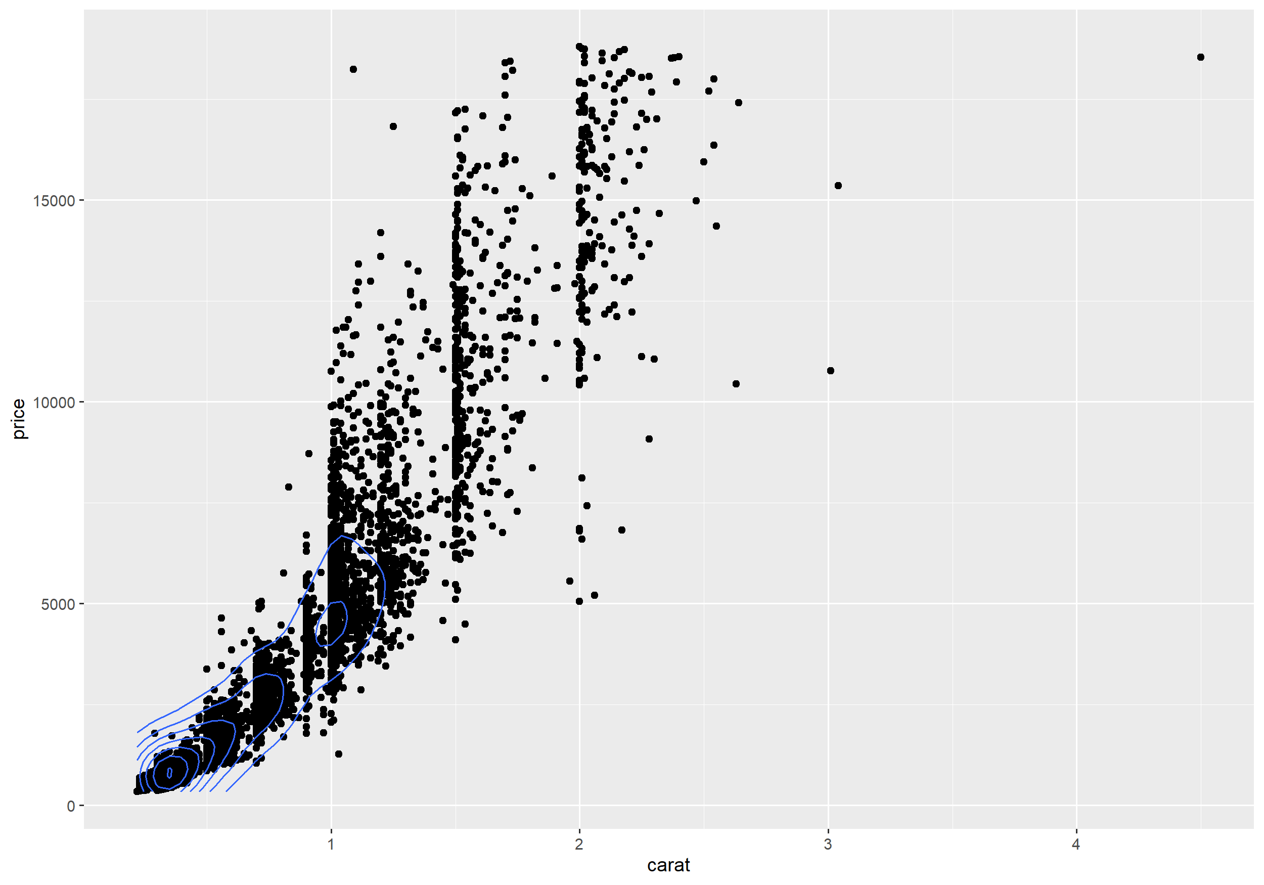
2D Density with geom = "polygon"
Example
ggplot(diamonds, aes(carat, price)) + geom_point() + stat_density2d(aes(fill = ..level..), geom = "polygon")2D Density with geom = "polygon"
Example
ggplot(diamonds, aes(carat, price)) + geom_point() + stat_density2d(aes(fill = ..level..), geom = "polygon")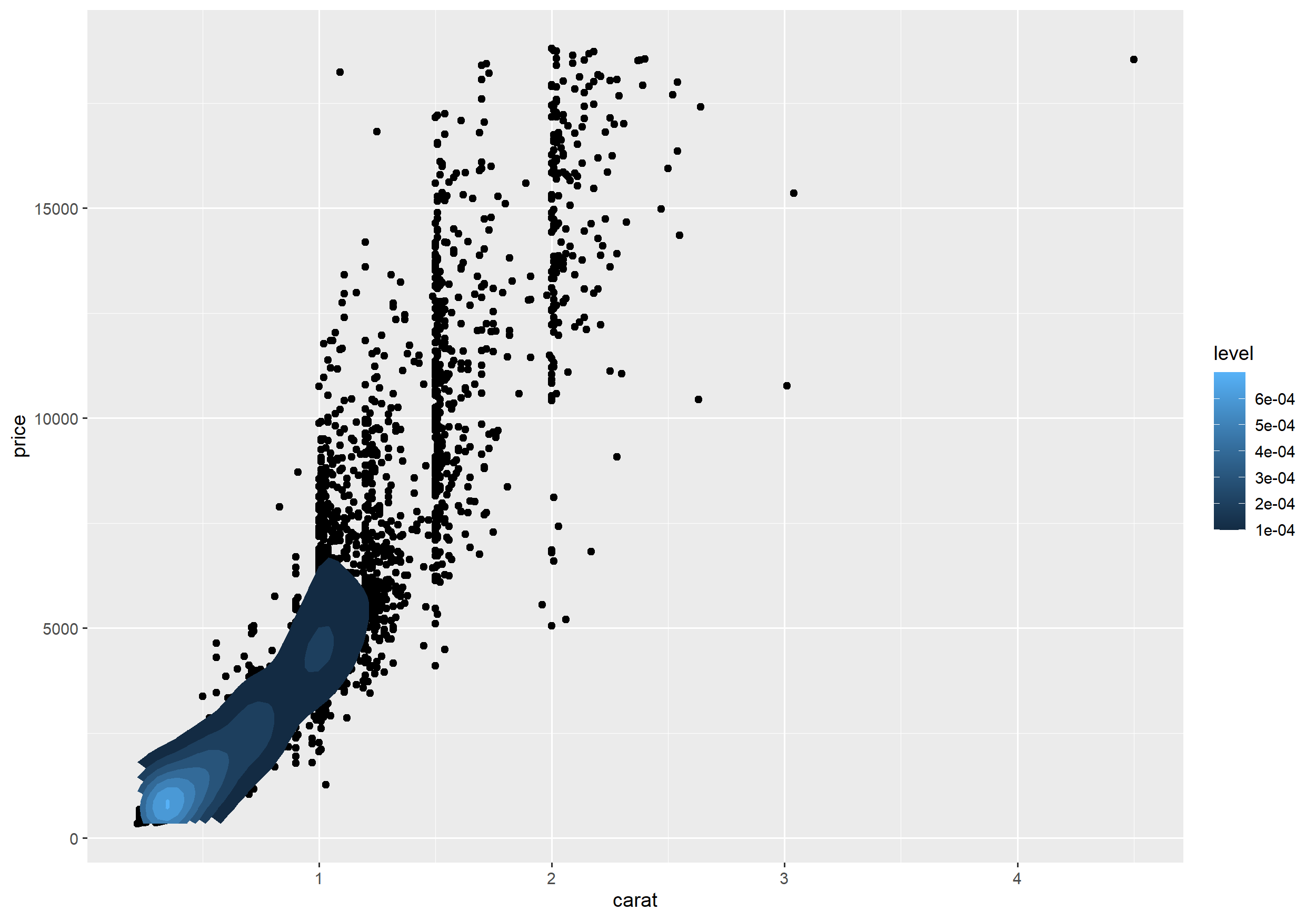
Faceting using one variable
- Faceting generates multiple plots each showing a different subset of the data.
Example
ggplot(diamonds, aes(carat, price)) + geom_point() + facet_grid( ~ cut)Faceting using one variable
- Faceting generates multiple plots each showing a different subset of the data.
Example
ggplot(diamonds, aes(carat, price)) + geom_point() + facet_grid( ~ cut)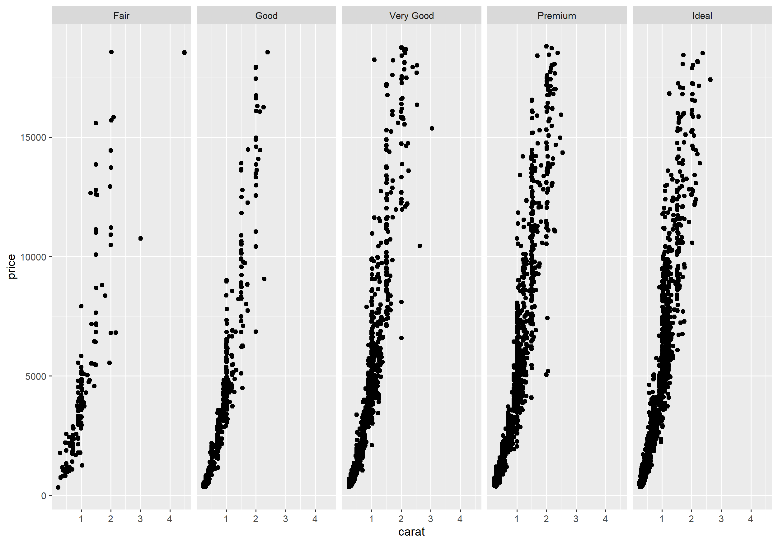
Faceting using two variables
Example
ggplot(data = diamonds, mapping = aes(carat, price)) + geom_point() + facet_grid(color ~ cut)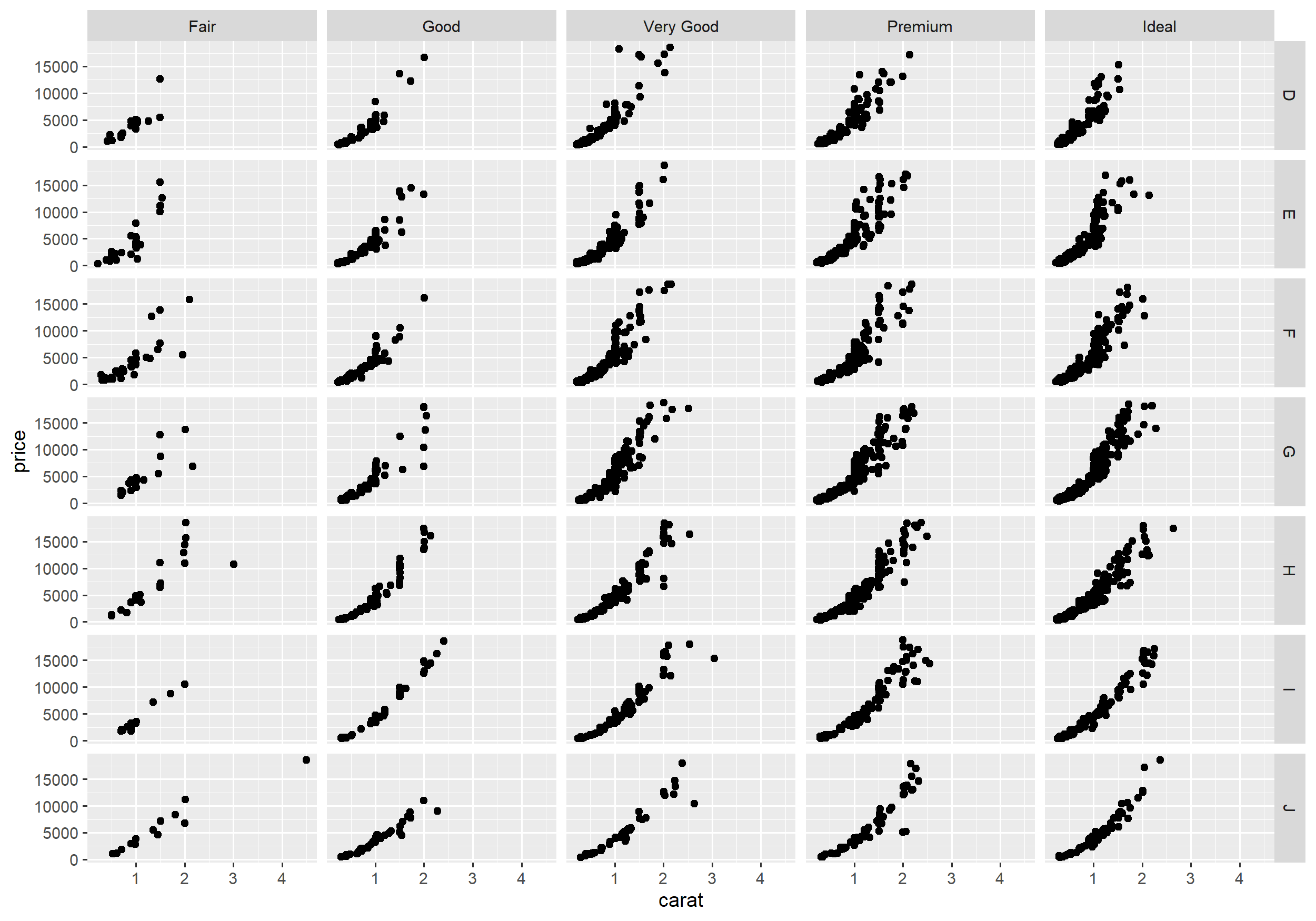
Position Adjustments
- Each geometric object has a parameter for position adjustment.ggplot(data = diamonds) +geom_bar(mapping = aes(x = cut, fill = clarity), position = "stack") # the default
Position Adjustments
Each geometric object has a parameter for position adjustment.
ggplot(data = diamonds) +geom_bar(mapping = aes(x = cut, fill = clarity), position = "stack") # the defaultInstead of stacking the bars we can position them side-by-side using
dodge.geom_bar(., position = "dodge")
Position Adjustments
Each geometric object has a parameter for position adjustment.
ggplot(data = diamonds) +geom_bar(mapping = aes(x = cut, fill = clarity), position = "stack") # the defaultInstead of stacking the bars we can position them side-by-side using
dodge.geom_bar(., position = "dodge")With
fillrelative proportions can be compared.geom_bar(., position = "fill")
Stacked Bar Plot
Example
ggplot(data = diamonds) + geom_bar(mapping = aes(x = cut, fill = clarity), position = "stack") # the defaultStacked Bar Plot
Example
ggplot(data = diamonds) + geom_bar(mapping = aes(x = cut, fill = clarity), position = "stack") # the default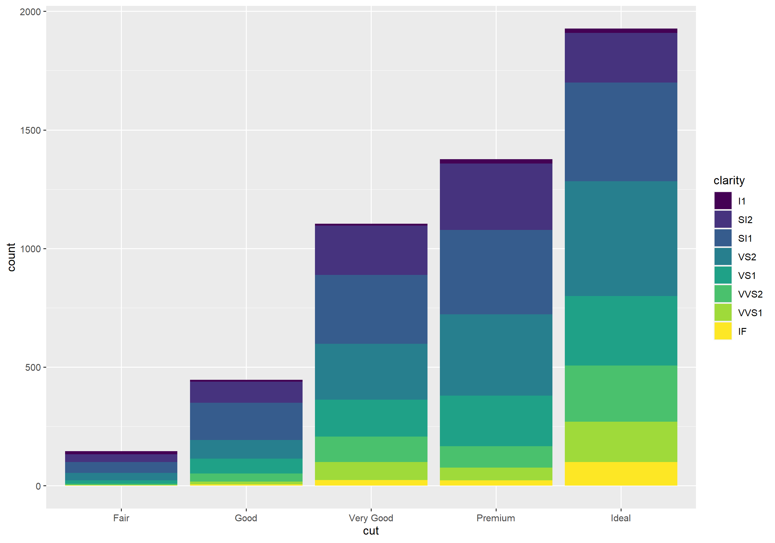
Dodged Bar Plot
Example
ggplot(data = diamonds) + geom_bar(mapping = aes(x = cut, fill = clarity), position = "dodge")Dodged Bar Plot
Example
ggplot(data = diamonds) + geom_bar(mapping = aes(x = cut, fill = clarity), position = "dodge")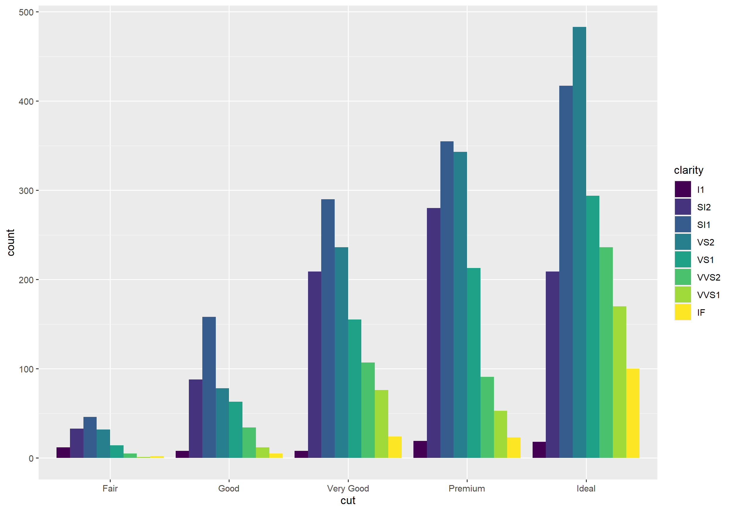
Filled Bar Plot
Example
ggplot(data = diamonds) + geom_bar(mapping = aes(x = cut, fill = clarity), position = "fill")Filled Bar Plot
Example
ggplot(data = diamonds) + geom_bar(mapping = aes(x = cut, fill = clarity), position = "fill")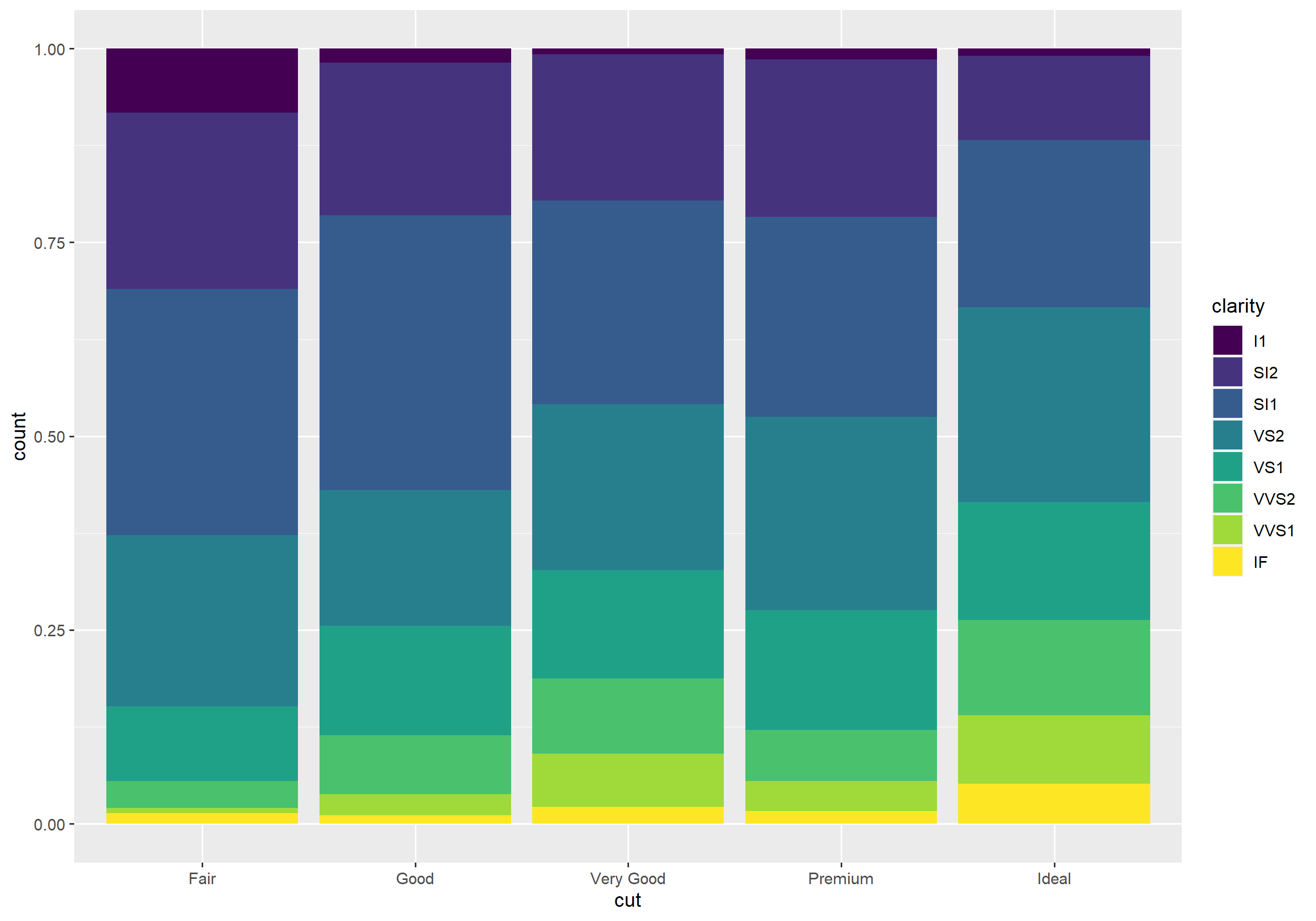
Scales
- Scales determine how the data are mapped to the aesthetics (e.g. which value takes which color).
- Scales are defined by functions of the form
scale_aestheticname_scalename().
Scales
- Scales determine how the data are mapped to the aesthetics (e.g. which value takes which color).
- Scales are defined by functions of the form
scale_aestheticname_scalename().
Example
ggplot(diamonds, aes(carat, price, color = cut)) + geom_point() + scale_color_grey()Scales
- Scales determine how the data are mapped to the aesthetics (e.g. which value takes which color).
- Scales are defined by functions of the form
scale_aestheticname_scalename().
Example
ggplot(diamonds, aes(carat, price, color = cut)) + geom_point() + scale_color_grey()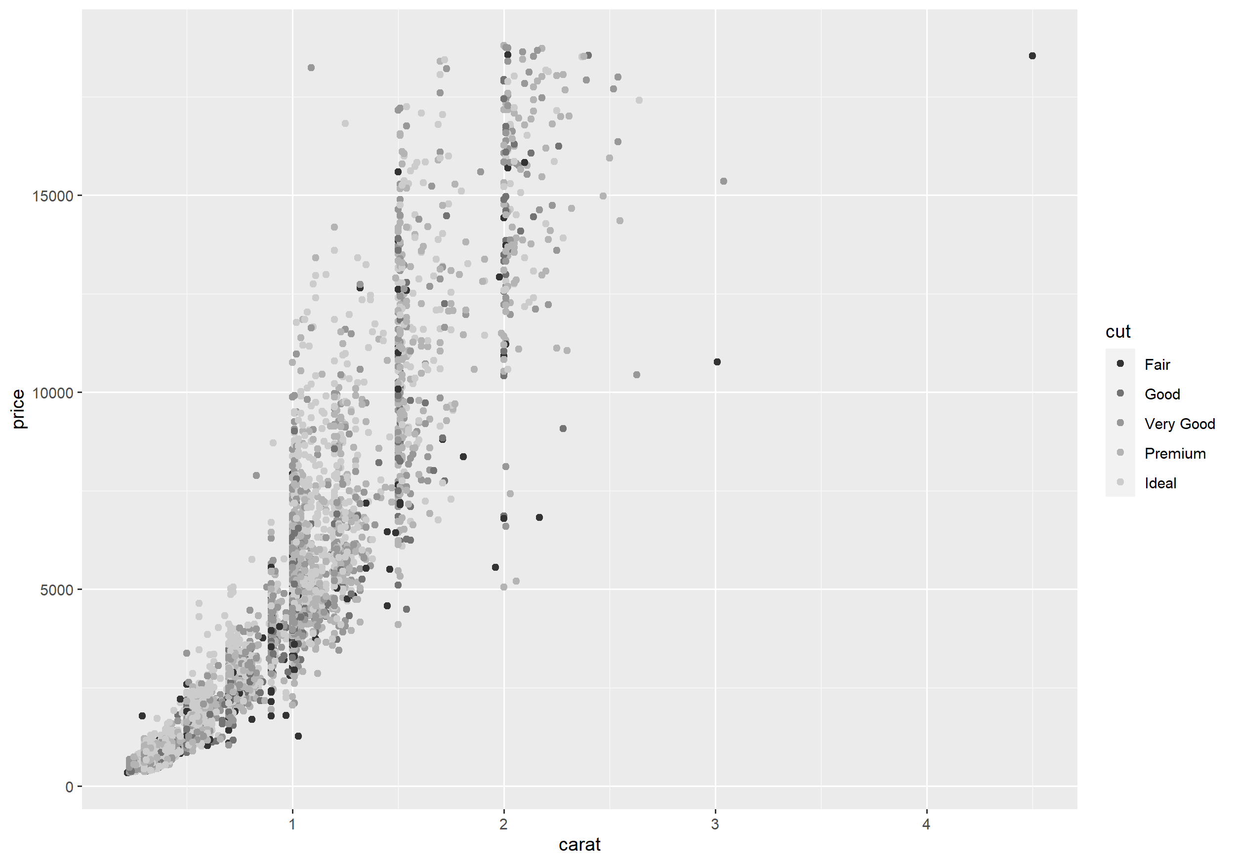
Scales
- You can also define your own scales.
Scales
- You can also define your own scales.
Example
ggplot(diamonds, aes(carat, price, color = cut)) + geom_point() + scale_color_manual(values = c("#c9792e", "blue", "green", "gray", "thistle2"))Scales
- You can also define your own scales.
Example
ggplot(diamonds, aes(carat, price, color = cut)) + geom_point() + scale_color_manual(values = c("#c9792e", "blue", "green", "gray", "thistle2"))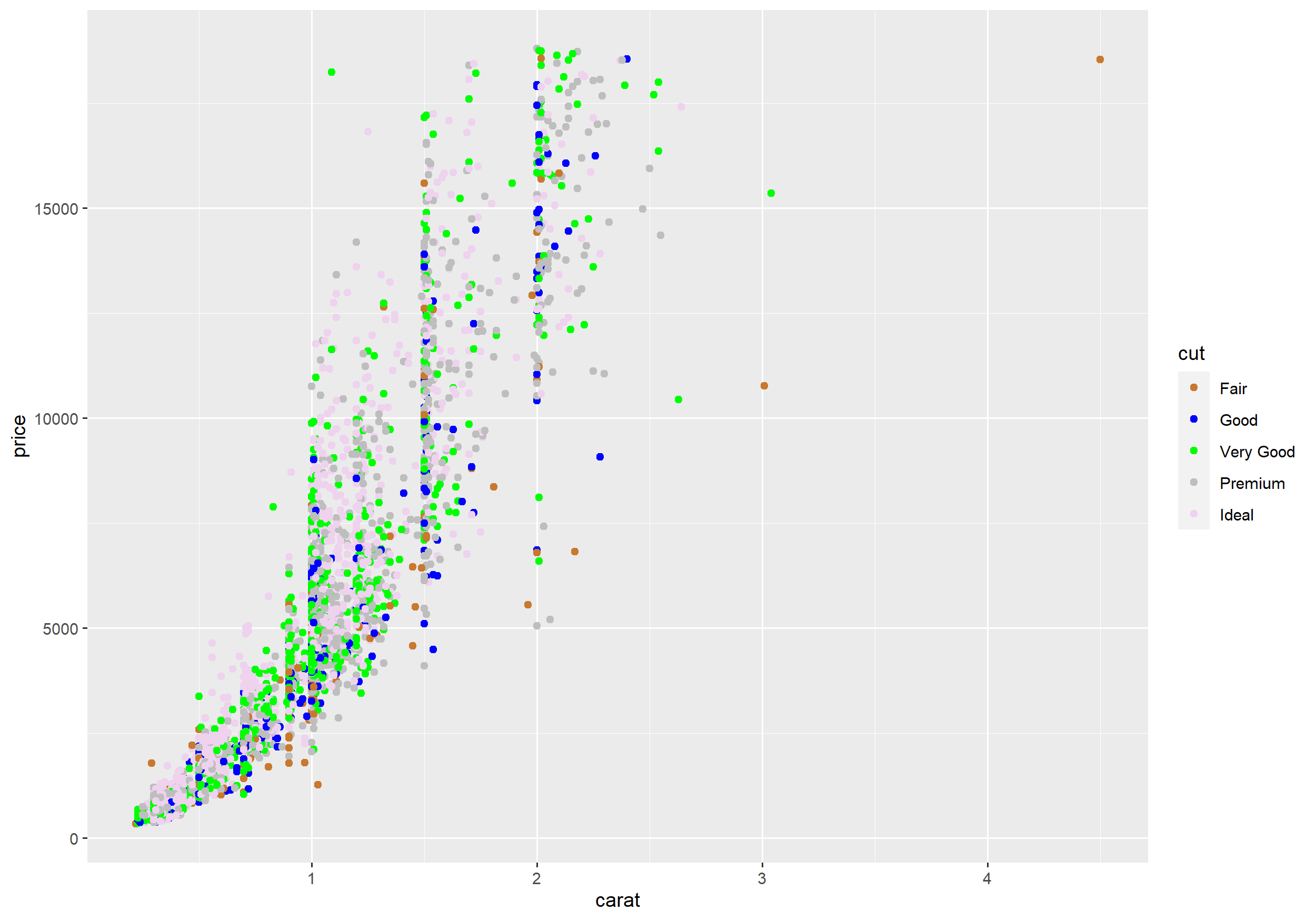
Titles and labels
labs() allows you to
- add a title and a subtitle
- add a caption
- add a tag
- change the axis labels
- change the legend title.
Titles and labels
labs() allows you to
- add a title and a subtitle
- add a caption
- add a tag
- change the axis labels
- change the legend title.
Example
ggplot(diamonds, aes(x = carat, y = price, fill = cut)) + geom_point() + labs(title = "Diamanten", x = "Karat", y = "Preis", fill = "Schnitt")Titles and labels
Example
ggplot(diamonds, aes(x = carat, y = price, fill = cut)) + geom_point() + labs(title = "Diamanten", x = "Karat", y = "Preis", fill = "Schnitt")Titles and labels
Example
ggplot(diamonds, aes(x = carat, y = price, fill = cut)) + geom_point() + labs(title = "Diamanten", x = "Karat", y = "Preis", fill = "Schnitt")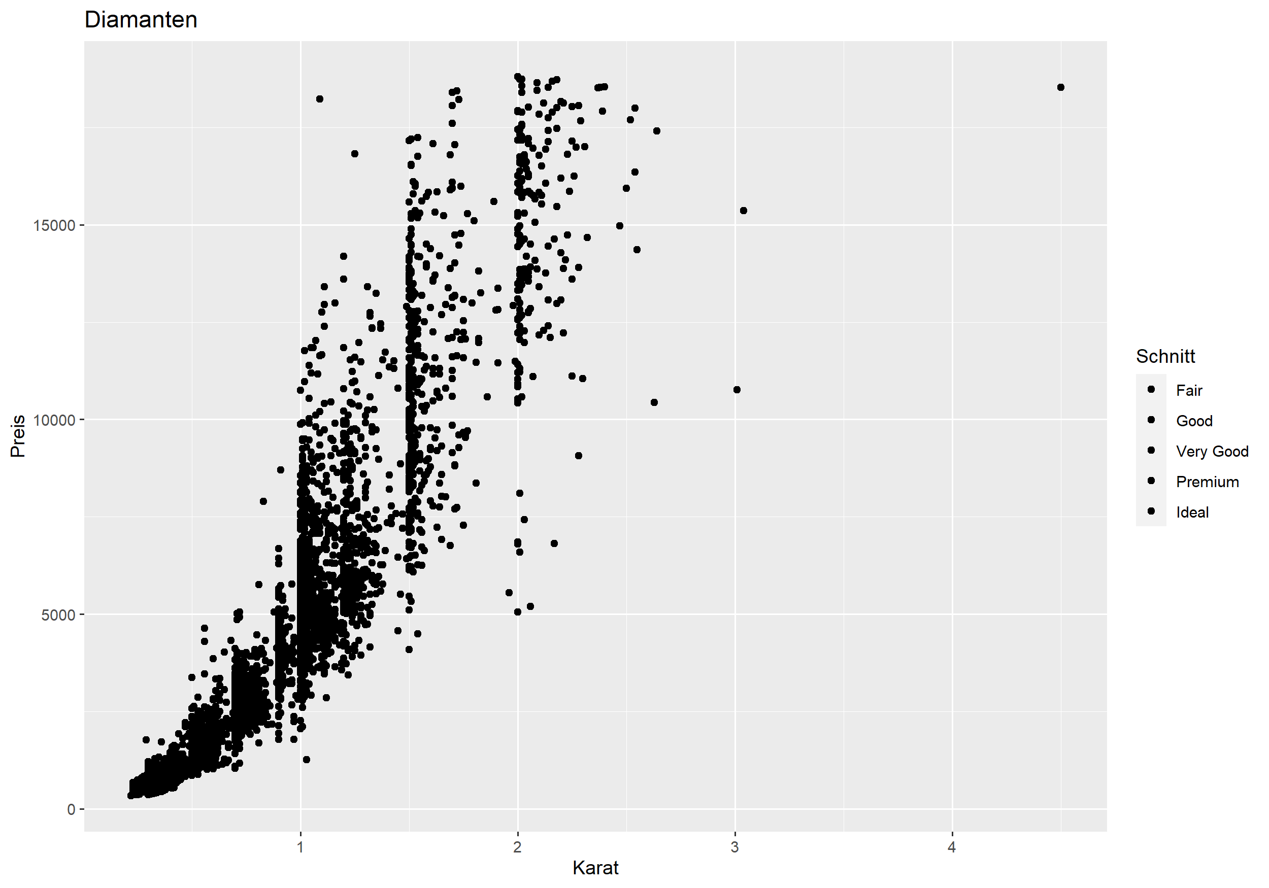
Themes
Themes control the appearance of the plot
- font type and font size
- background
- ticks marks and labels
- grid lines
- ...
Themes
Themes control the appearance of the plot
- font type and font size
- background
- ticks marks and labels
- grid lines
- ...
There are many predefined themes. However, if you like you may also define everything yourself.
Themes
Themes control the appearance of the plot
- font type and font size
- background
- ticks marks and labels
- grid lines
- ...
There are many predefined themes. However, if you like you may also define everything yourself.
Example
ggplot(diamonds, aes(carat, price, color = cut)) + geom_point() + theme_bw()Themes
Example
ggplot(diamonds, aes(carat, price, color = cut)) + geom_point() + theme_bw()Themes
Example
ggplot(diamonds, aes(carat, price, color = cut)) + geom_point() + theme_bw()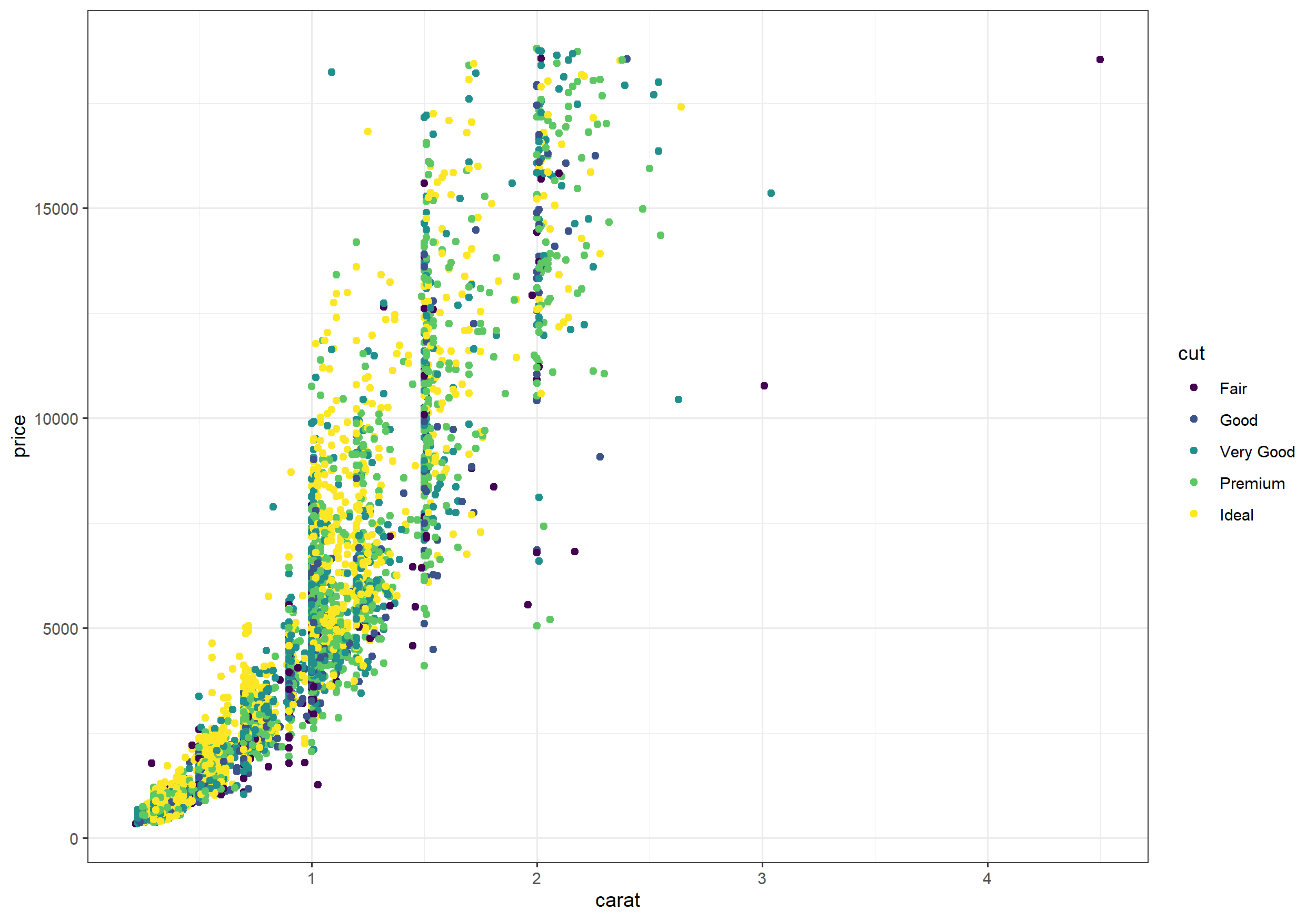
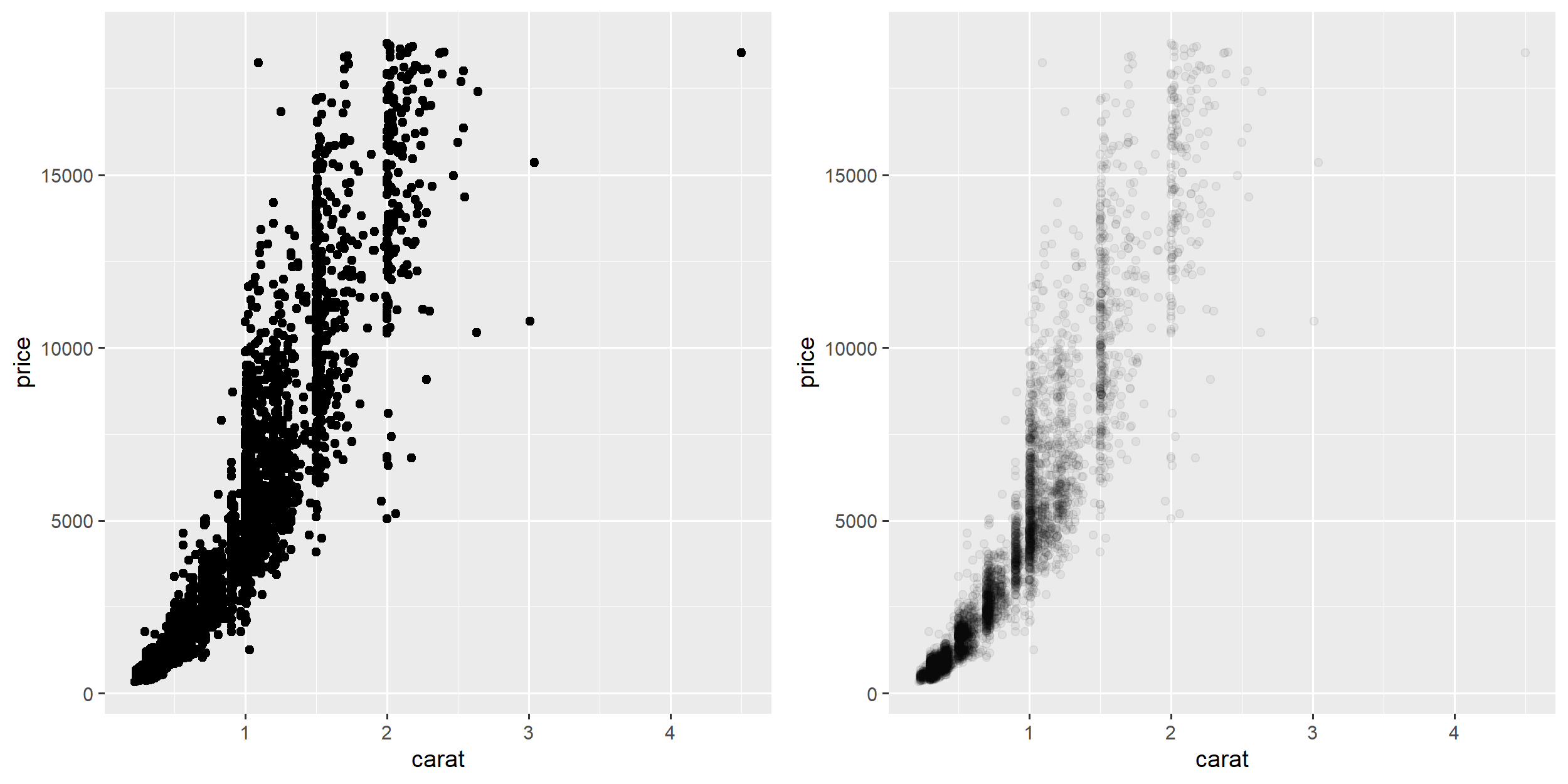
Overplotting
- If plotting many data points with similar values individual points overlap and disappear.
- Overplotting can make it hard to see the pattern in the data and may render a plot useless.
- There are a couple of ways to address overplotting such as:
- only plot subsets of the data (e.g.
facet_grid) - making the points transparent
- only plot subsets of the data (e.g.
Example
library(cowplot)over1 <- ggplot(diamonds, aes(carat, price)) + geom_point()trans <- ggplot(diamonds, aes(carat, price)) + geom_point(alpha = 0.05)plot_grid(over1, trans)Transparency
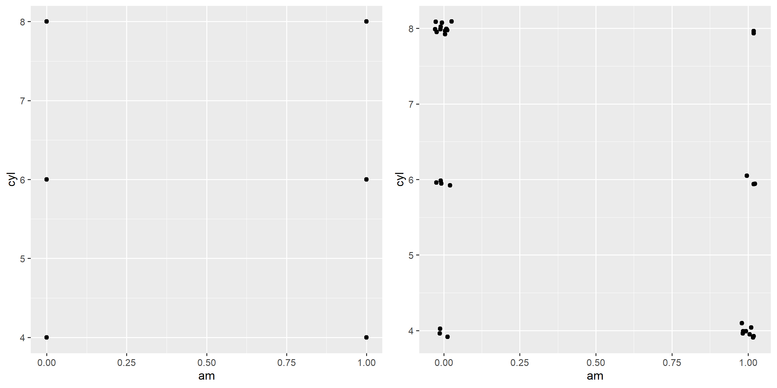
Jittering
- Even in cases with only a few data points overplotting can become an issue if there is only a small number of unique values.
- Adding small random numbers can help to reduce overplotting.
Jittering
- Even in cases with only a few data points overplotting can become an issue if there is only a small number of unique values.
- Adding small random numbers can help to reduce overplotting.
Example
over2 <- ggplot(mtcars, aes(am, cyl)) + geom_point() jitter <- ggplot(mtcars, aes(am, cyl)) + geom_jitter(width = 0.03, height = 0.1) plot_grid(over2, jitter) # from cowplotJittering
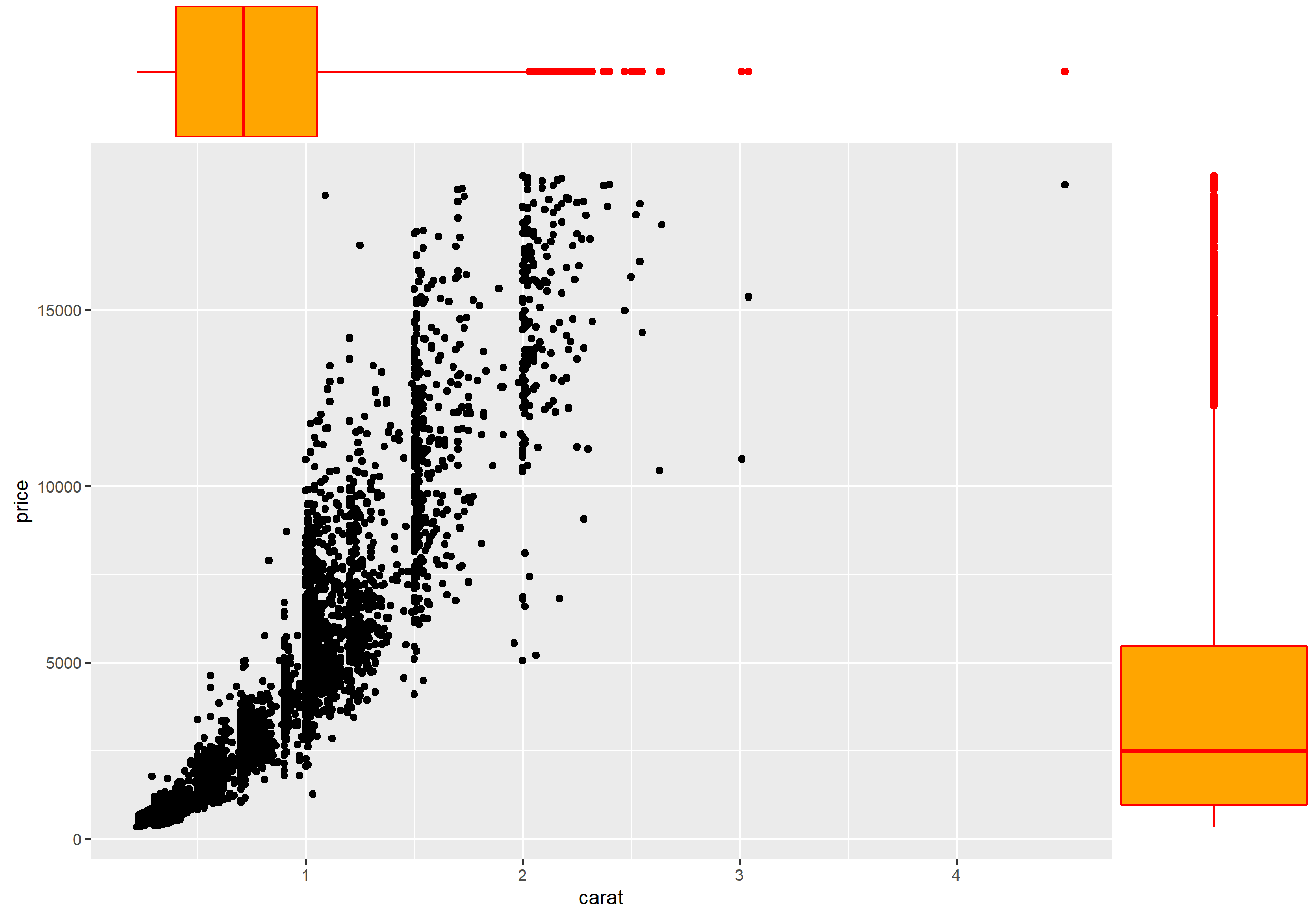
Composite Plots
- There are many packages extending
ggplot2such ascowplotandggExtra. - With basic
ggplot2it is e.g. quite tricky to create a composite plot as created byggExtra::ggMarginal()
Composite Plots
- There are many packages extending
ggplot2such ascowplotandggExtra. - With basic
ggplot2it is e.g. quite tricky to create a composite plot as created byggExtra::ggMarginal()
Example
library(ggExtra)scatter_plot <- ggplot(diamonds, aes(carat, price)) + geom_point()ggMarginal(scatter_plot, # ggExtra type = 'density', margins = 'both', size = 5, colour = '#FF0000', fill = '#FFA500' )Composite Plots
Exercises
- Download the Titanic data set from Moodle and
- use a bar plot to show how many people survived the Titanic compared to those who didn't.
- add a color coding to the previous plot to visualize the differences between the passengers' gender.
- split the previous plot into three plots based on the passengers' class.
- compare the age distribution between survivors and non-survivors.
- Try to answer the following questions about the mpg dataset (comes with ggplot2) using ggplot.
- How are engine size and fuel economy related?
- Do certain manufacturers care more about economy than others?
- Has fuel economy improved in the last ten years?
- Compare the two data sets economics and economics_long (both come with ggplot) with respect to the ease of use when working with ggplot.
- Reproduce the plot created by the following code with ggplot.
plot(mtcars$mpg ~ mtcars$wt, xlab = "wt", ylab = "mpg", pch = 19, ylim = c(5, 35))mod <- lm(mpg ~ wt, data = mtcars)abline(mod, col = "red")wt_new <- seq(min(mtcars$wt), max(mtcars$wt), by = 0.05)conf_interval <- predict(mod, newdata = data.frame(wt = wt_new), interval = "confidence", level = 0.95)# setup vertrices of polygon (for shading the CI):p <- cbind(c(wt_new, rev(wt_new)), c(conf_interval[, 3], rev(conf_interval[, 2])))polygon(p, col = adjustcolor("steelblue", alpha.f = 0.5), )lines(wt_new, conf_interval[, 2], col = "steelblue", lty = 2)lines(wt_new, conf_interval[, 3], col = "steelblue", lty = 2)